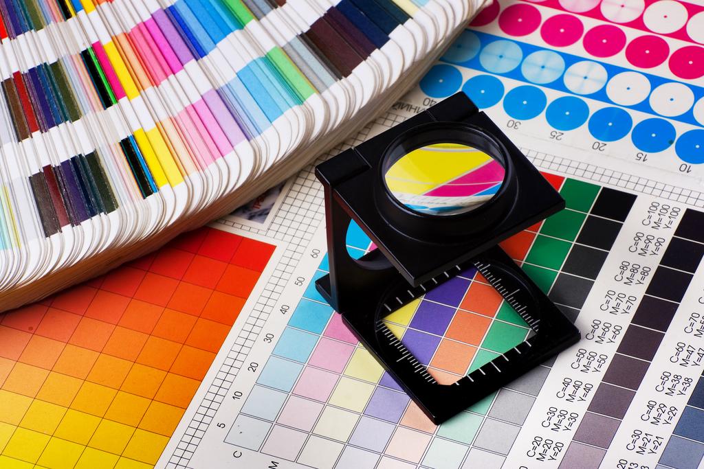
In an era dominated by digital marketing, print advertising remains a powerful tool for brands seeking to engage with their audience on a deeper level. Despite the prevalence of online ads, print media continues to thrive, particularly in local markets where it serves as a trusted source of information and connection. The enduring appeal of print lies in its ability to create a tangible, memorable experience for consumers. Central to this impact are the design elements that make print advertisements not just visually appealing but also psychologically persuasive. Understanding how these design elements influence consumer behaviour is key to creating effective print ads that resonate with target audiences.
The Power of Visual Hierarchy
Visual hierarchy is the arrangement of elements in a way that directs the viewer’s attention in a specific order. In print advertising, this design principle is crucial in guiding consumers through the ad’s message. By strategically positioning headlines, images, and call-to-action buttons, advertisers can control what the viewer sees first, what they focus on next, and how they ultimately interpret the ad.
For instance, a well-placed headline at the top of the page, combined with a striking image just below it, can draw the viewer’s eye downwards, creating a natural flow that leads them to the most important information. This deliberate structuring ensures that the key message is not only noticed but also retained, increasing the likelihood of a positive response from the consumer.
The Emotional Impact of Colour
Colour is one of the most influential design elements in print advertising, capable of evoking emotions and influencing perceptions. Different colours carry different psychological connotations, which can be leveraged to align with a brand’s message and the emotions they wish to evoke in their audience.
For example, red is often associated with excitement, passion, and urgency, making it a popular choice for advertisements that aim to provoke an immediate response, such as sales or limited-time offers. On the other hand, blue is commonly linked with trust, calmness, and reliability, which is why it is frequently used by brands in industries like finance or healthcare.
Understanding the psychology of colour allows advertisers to create ads that not only catch the eye but also resonate emotionally with consumers, making the message more compelling and memorable.
Typography: More Than Just Words
Typography, the art and technique of arranging type, plays a significant role in the effectiveness of print advertising. The choice of font, size, spacing, and alignment can dramatically affect how the ad is perceived and how the message is communicated.
Bold, large fonts are typically used for headlines to grab attention, while smaller, more subdued fonts are used for body text to ensure readability. The style of the font also conveys a certain tone—serif fonts, with their classic and formal appearance, are often used for luxury brands, whereas sans-serif fonts, with their clean and modern look, are favoured by tech companies.
Typography also affects the ad’s overall readability and clarity. Proper spacing and alignment ensure that the text is easy to read, while thoughtful font choices can enhance the message’s tone and reinforce the brand’s identity. By carefully selecting and arranging typography, advertisers can create a print ad that is not only visually appealing but also effective in delivering the intended message.
The Role of Imagery in Storytelling
Imagery is a powerful tool in print advertising, capable of conveying complex messages and emotions without the need for words. High-quality, relevant images can capture attention, evoke emotions, and even tell a story, making them an essential component of any effective print ad.
When choosing images for print advertising, it’s important to consider their relevance to the product or service being advertised, as well as their emotional impact on the viewer. An image that resonates with the target audience can make the ad more relatable and memorable, increasing the likelihood of a positive response.
Moreover, the use of imagery in print advertising allows brands to create a narrative that engages the viewer on a deeper level. Whether it’s a photograph that evokes nostalgia or an illustration that sparks curiosity, the right image can help convey the brand’s message in a way that words alone cannot.

The Subtle Art of White Space
White space, or negative space, refers to the areas of a design that are left empty. While it might seem like an afterthought, white space is a crucial design element in print advertising, contributing to the overall effectiveness of the ad.
White space helps to create balance and harmony in a design, making it easier for the viewer to focus on the key elements of the ad. It prevents the layout from feeling cluttered or overwhelming, which can detract from the message being communicated. By giving the design elements room to breathe, white space enhances the clarity and impact of the ad.
In addition to improving readability, white space can also be used to draw attention to specific elements of the ad. By surrounding a key message or image with white space, advertisers can make it stand out more prominently, ensuring that it captures the viewer’s attention.
Consistency in Branding
Consistency in branding is another important aspect of print advertising design. Every element of the ad, from the colour scheme to the typography, should align with the brand’s overall identity. This consistency helps to reinforce brand recognition and trust, which are critical factors in influencing consumer behaviour.
For instance, using the same colour palette, fonts, and imagery style across all print ads ensures that the brand is easily recognisable, no matter where the ad appears. This consistency not only strengthens the brand’s presence in the market but also helps to build a connection with the audience, making them more likely to respond positively to the ad.
Final Thoughts
The art of persuasion in print advertising is deeply rooted in the strategic use of design elements. From visual hierarchy and colour psychology to typography, imagery, and white space, each component plays a vital role in capturing attention, evoking emotions, and influencing consumer behaviour. By understanding and leveraging these design principles, brands can create print ads that are not only visually appealing but also highly effective in achieving their marketing goals.
Whether you’re a small business or a large corporation, mastering the art of print advertising can help you connect with your audience in a meaningful way, especially in local markets like print media Wollongong, where print still holds a significant influence. As the digital landscape continues to evolve, the timeless appeal of print advertising remains a powerful tool for brands looking to make a lasting impression.


